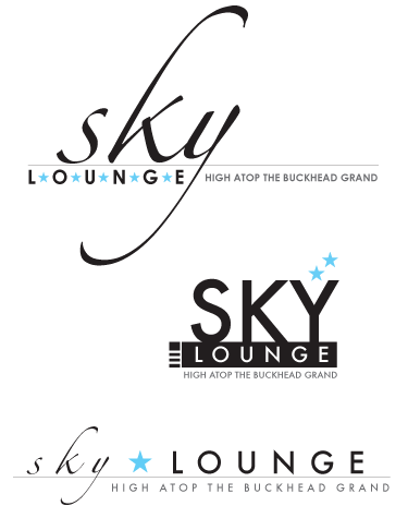
i did a little pro bono logo design the other night for the members club on top of our building. which do you like? i presented these yesterday. three guesses which one they picked.
my comments are entirely personal and do not represent the views of washingtonpost.newsweek interactive or any other washington post company affiliate.


14 comments:
they all look awesome...nice work! i'll say #3
I like #3 as well
I'm guessing #2
Hmmm. I've gotta go for #1. (They're all super!)
I like 1 and 3, I'm guessing they went with 3. k
They are all great, but I like the second one. It's the boldest and I like that the "Y" is like a martini glass.
I would have a hard time choosing just one. They are all super!
You do the best logos! #1 is my favorite but I think they selected #2.
I say #2
My vote goes for #3-sophisticated elegance
I say #1
i pick no. 2 for its fabulous y-martini glass, though they are all so very nice.
i'm trying to imagine right now how much trouble i'd get myself in if i had a club at the top of my building.
you lucky duck.
they all look awesome! maybe i'd pick #1.
they picked the top one. good guessing!!
Post a Comment