decor8 is having a super fun contest in which i'm very excited to participate. the complete rules are here, but in a nutshell, you have to photograph your workspace and then head over to fabulous stationery and pick out the *one* notecard that best represents your space. fun, no? i've looked through the 300+ cards and narrowed it down to two. which do you think is the better choice?
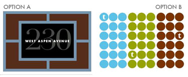
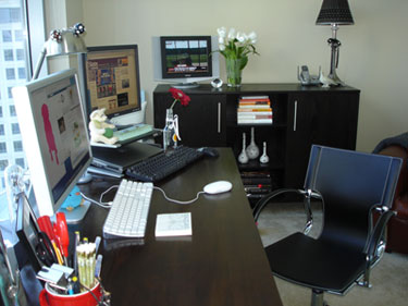
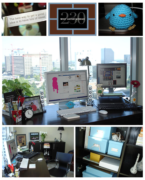
zoom in for more shots of my space and to see the notecards in context: option a | option b
ps ... the contest ends september 28. hurry!


17 comments:
I say B...and I love your workspace!
I say A. Love the clean lines...
Sorry I missed tennis...
Cristi
well, a seems to directly relate more to your workspace. but i like b better as a card.
how's that for helpful? (no really, go with b!)
Hi Holly,
Love your "sleek" workspace. This is almost too difficult as my first task this morning but I am going to vote for option A. I think the "square" feel of the first card more closely represents the feel of your focal point which is your chair. I like the repetition in the second card as it relates to your window covering but I still think A is a better fit. Can't wait to hear what you choose. k
I say A...the balance of color matches your workspace better.
Another vote for A - I like both cards but think that A more closely matches the clean-lined elegance of your space.
How are you liking that desk chair? Mine is going to need to be replaced soon and I need to find that balance of attractive but comfortable.
I'm gonna go with option A...it's more you office than B.w
Hi Hollyloo!
I would say A may be more of symbol of your workspace, but B is certainly more of a symbol of your personality. If there was a contest about the worker and not the workspace...you'd definitely be B!!!!
Option A for sure.
color, symmetry, balance
are the walls in your office a soft yellow?
thanks for the help, everyone. i'm still not sure which way i'll go, but will be sure to let you know once i decide!
anonymous, the walls in my office are kind of a light khaki. think coffee with lots of cream!
I pick A
I vote for Option A!
ok, so i sent my entry today! i picked option a. here is what i sent ...
everything in my office is very modular – right down to the view. i have a few organic shapes ... the plants, the vases, a little bird, what’s on my monitor ... thrown in to create some visual interest and add a little personality. my office is also mostly brown accented by some pops of blue.
the card i selected, called frame, was a perfect match for my space. it’s mostly brown with a pop of blue. it, too, is very modular but has the organic shapes in the numbers of the address. the overall look is clean, modern and sophisticated, with just a hint of playfulness – a lot like my, much loved, office.
thanks everyone for helping me decide. i'll let you know if i win. fingers crossed!
ps ...erin t, i love the desk chair. great price, my back isn't sore anymore and still looks great after a few months of me sitting in it for 9 hours a day. it's the parallel desk chair from crate and barrel and is still on sale for $199. yay!
At first I thought A but I am voting for B. The blue dots look like the little blue bird.
Amy
Definitely A. Or B. No, no ... A. Then again, maybe B. B is good. Yes, yes, B. A.
Post a Comment